

Medi Mate is an interactive mobile application that will reduce medical pre-procedure anxiety for children and their parents. The application provides families a variety of educational and supportive tools to help prepare for difficult appointments and procedures.
Or scroll to read the full case study
What’s the problem?
When children’s pain and fear aren’t well managed during medical procedures, there are both short and long term consequences. Procedures can take longer and have an increased risk of adverse events (such as fainting or being physically restrained), and children are likely to need more medications for pain and to develop negative or traumatic memories.
These fears can lead to delays or avoidance of necessary health care, even when children become adults.
Summary of Competitor Study
MYSURGERY, MYOP, and LITTLE JOURNEY are some of the highest rated applications that prepare people for medical procedures. Each application has its own strategy and I believe they all fall short of filling the gaps within this space. I believe that young patients and their families want and deserve a product that can meet all of their needs.
These needs include:
Education
Relaxation
Customization
Community
Procedure specific information

RESEARCH

The scope changed due to the insights gained during user interviews. The participants confirmed that children need to be prepared for medical procedures but they also identified that parents could benefit from this product. Parents/caregivers need accessible and reliable information and tools to prepare themselves and to help their child prepare.
DESIGN
After deciding which flows to design I began to sketch my initial layout ideas on paper then placed elements onto low fidelity wireframes to add a grid structure.
Low Fidelity Wireframes
I decided to include the sign in flow due to the importance of the information collected on these screens. On “Step 2” the user fills out patient and procedure information which helps to personalize the Medi Mate experience.
Once signed in the patient is greeted by name, will receive information and activities based on their specific procedure, and will be shown age appropriate content while in the patient portal.
Parent Portal


Field Study
Mobile healthcare app development has become instrumental for healthcare providers to be able to meet the ever-changing needs of their patients and stay ahead of competitors.
I began this project by completing a field study with a fair amount of immersion. The timing of this project worked out well. During the research phase, I was taking my four year old son to medical appointments in preparation for a procedure. These appointments helped me to gain knowledge as a father and researcher. I took the opportunity to ask the medical staff many questions regarding the most effective ways to prepare a child and the benefits of being prepared for procedures.
“It's important to tell children the truth about why they are going to the hospital, how long they will stay, and what they can expect to see and do there. (Example: "You will wear a hospital gown and see nurses and doctors.") Encourage your child to express fears and to ask questions. Children this age worry about being separated from their parents, so it's important for you to reassure your child that you will be there as much as possible. Reading books or watching videos about going to the hospital can help both of you learn how to cope with feelings and concerns.”
After learning about the medical field, I needed to find out what type of products are currently offered in this space and how well they are solving the users problems.

At this point I had some ideas and hypotheses forming and it was time to gather more research by completing user interviews. I chose to interview five parents of ranging ages and backgrounds. My goal while conducting these interviews was to gain insights into the users personal experiences with the often difficult task of preparing their child for a medical procedure.

Participant 1
Participant 2
Participant 3
Participant 4
Participant 5
ANALYSIS
After completing each user interview, the recordings were transcribed and the transcriptions were turned into a collection of sticky notes. Then I used the notes to create an affinity map with four categories of information. Next I read through the notes again and added stars to the comments with the most impact within each category.
Stand Out User Pain Points

After collecting all the valuable data from my user interviews I had a much better understanding of who my users are and the challenges they face. I used my research to create user personas. Each persona represents a section of people that would interact with this program the most. In this case the groups represented are; parent, child, and medical professionals.
Creating personas is a very important step in my process. I continue to use these personas throughout the project to remind myself of who I am designing for and the problems I am working to solve.

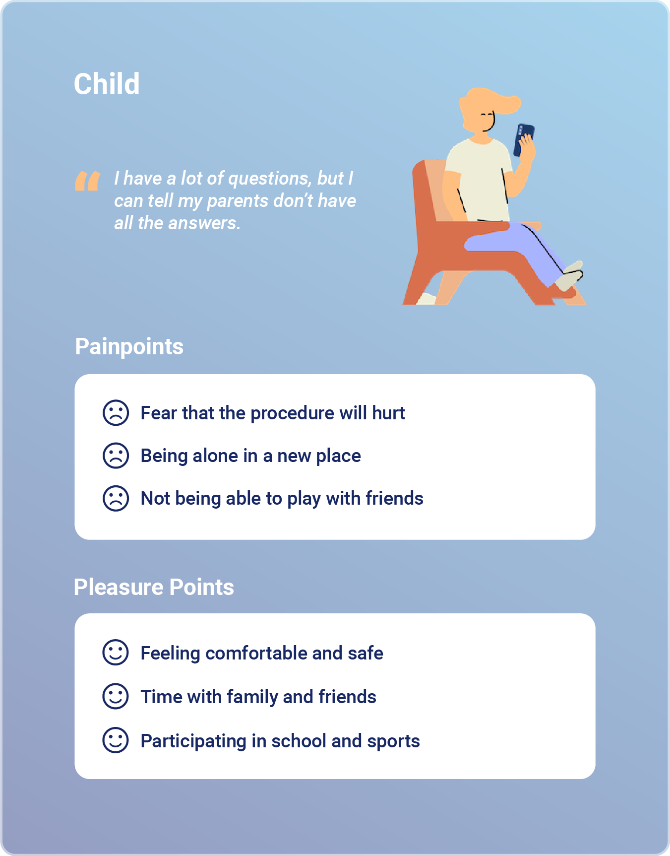
Child Point of View and How Might We Statements
Children need to know what will happen and what will hurt during a medical procedure to relieve anxiety because unexpected stress and pain can be traumatic.
HMW show/explain medical procedures to children?
HMW prepare children/families for painful or stressful medical procedures?
HMW relieve anxiety caused by medical appointments?
HMW reduce the likelihood of trauma caused by medical appointments?

ITERATIONS
Due to time restrictions, only the highest priority revisions were completed, which were decided on using evaluative research and the insights collected.
Iteration 1
Differentiate between patient and parent portal.
Iteration 2
Make the timeline sections a punch list to help users track their progress.
Iteration 3
Adjust the icons in parent portal to more clearly symbolize the options.
Before Iteration 3

Iteration 2
Make the timeline sections a punch list to help users track their progress.
To create the check list option, large bullet points were added to each step in the timeline. When the bullet points are clicked, the state changes to solid. This gives the user the ability to easily track their progress and feel accomplished when checking off tasks.


Sign in

Parent Portal

Parent Point of View and How Might We Statements
Parents need a database of factual information to research specific medical procedures because unintentionally lying to your child will lead to a negative hospital visit and mistrust of parents and doctors.
HMW organize a database with medical information?
HMW help parents research medical procedures?
HMW fact check information?
HMW improve hospital visits for pediatric patients?
HMW create trust between children, families, and doctors?
IDEATION
My next step was to figure out which flows and screens would need to be designed so that I can test my feature ideas and key hypotheses.
The original idea for this product was to design an interactive application to help pediatric patients prepare for an upcoming procedure. The main user would be the young patient and the parent/caregiver or doctor would introduce the patient to the product then help walk them through the information as needed.
User Flow


Patient Portal


Sign in


Doctor Point of View and How Might We Statements
Doctors need quality tools that help pediatric patients and families because prepared patients allow the entire medical team to stay on schedule and provide the highest level of care possible.
HMW provide doctors with quality tools?
HMW help pediatric patients/families prepare for medical procedures?
HMW keep the medical team on schedule?
Takeaways
User Interface Kit
USER TESTING
After increasing the cohesiveness of Medi Mate a prototype was built and testing was completed with eight potential users. The testing yielded great feedback and suggestions for adjustments to improve the product.
Medi Mate was designed to be accessible for adults and children of all ages. The testing subjects included five parents and three children. The children had a slightly modified script and only used the patient portal flow, but all eight subjects were able to complete the requested tasks without hitting dead ends or becoming frustrated.
User Quotes
“That’s adorable, I love this.”
“I like how straightforward the timeline is, the steps are very clear.”
“It’s got all the info you would want.”
“Clean layout, soothing colors, and I like the logo.”
After Iteration 1
Medi Mate’s design includes two separate portals of resources. Patient portal includes age appropriate information, games, books, etc. Parent portal includes more extensive information about specific procedures, tips on how to prepare your child, and an experience blog for parents to share and read helpful tips.

Site Map
Task Flow


Before Iteration 1
Sign in

Before Iteration 2
Mid Fidelity Wireframes
A bright colorful pallet was added to excite the young users and draw attention to the CTA buttons. I also added a filler logo, icons, and began adding more descriptive text.
After finishing these wireframes I found that I went a bit over board with the “child friendly” color pallet. I knew that moving forward I needed to invest some time into the branding and mood of this design.
Patient Portal


Patient Portal

Next I decided to work on the Medi Mate brand. I wanted to establish a logo and system that reflects the values of this product and most importantly its users.
I selected the blue gradient because it calls to mind feelings of calmness and relaxation, blue is also seen as a sign of stability and reliability.
The heart symbolizes the love, care, and support needed to prepare for and recover from a medical procedure.
The circle and plus combination is a special sign of neutrality and protection. It is used to safeguard the wounded and sick and those who care for them.


Parent Portal
High Fidelity Wireframes
This iteration includes many changes, the most obvious being the color pallet. Mentor meetings and peer critiques confirmed that the original design lacked a cohesive interface design to showcase the product.


Other notable iterations that have potential to be added to this product:
Security feature within the parent portal to protect children from seeing or reading information that is not appropriate for their age level.
Notebook feature that would be used for feelings, thoughts, or important information about upcoming appointments.
Iteration 1
Differentiate between patient and parent portal.
To assist with differentiating between the portals the gradients were adjusted. The patient portal is a lighter variation of the same blue gradient and the parent portal is a darker variation. This iteration will help the user to quickly understand which portal they are in without thinking or reading.
After Iteration 3
Iteration 3
Adjust the icons in parent portal to more clearly symbolize the options.
To avoid confusion between the Procedure Info button and the Experience Blog button the icon for Procedure Info was changed to a stethoscope. The stethoscope icon is a great fit for the Procedure Info button. It represents trusted medical knowledge.
FINAL RESULTS
Creating this product was personal journey. My son was the inspiration behind my original hypothesis and goals. Owen is four years old and in his young life he has already been to the hospital for multiple procedures. While creating Medi Mate he had a sleep study, which resulted in a diagnosis of mild sleep apnea. Due to this diagnosis and other factors, our pediatrician suggested a tonsillectomy and adenoidectomy. He recently had the surgery and is recovering better than we had expected.
While taking my son to appointments, I had the opportunity to speak with many doctors and nurses who willingly shared their unique perspective, insights, and how they suggest to prepare for surgery and recovery. They were also excited and encouraging when I described this product.
The research phase of this project seemed easier than other projects due to my immersion in the topic. Medi Mate did have its challenges though. I found myself over designing the original UI, seen in the mid fidelity wireframes. The result was a lack of cohesion in the brand identity. I decided to use the existing structure but redesign the identity from scratch. It took some extra time but it was a valuable lesson learned.
My goal was to create a product that children of all ages could benefit from and could make them feel as confident and comfortable as possible going into their procedure. I believe that I achieved that goal and more. The addition of the parent portal transformed a kid friendly app into a powerful resource that has the potential to help a wide range of users in any demographic.
The next steps for this project would be to build each flow, then run another round or two of user tests and create iterations to transform Medi Mate into a fully functional application.
PROJECT DURATION
80 hours
MY ROLE
Sole UI/UX Designer & Researcher
TOOLS
Figma - Miro - Illustrator
DESIGN
Low-Fi Wireframes
High-Fi Wireframes
Interactive Prototype
FEEDBACK
User Testing
Mentor Advice
Peer Critiques
ITERATIONS
Iterations
Small Details
Copywriting
PROCESS


After Iteration 2

RESEARCH
Field Study
User Interviews
ANALYSIS
Affinity Map
How Might We
Personas
IDEATION
Site Map
User Flow
Task Flow